Website Redesign · UX/UI · Art Direction
Peterbilt responsive website redesign
Reimagining one of America's most iconic truck manufacturers for the modern digital era.
A ground-up website redesign for one of America's most iconic truck manufacturers: translating engineering excellence and craftsmanship into a modern, responsive digital experience.
My contribution
I led UX strategy, information architecture, user flows, responsive interface design, visual direction, the component library and development specifications.
I worked with agency strategists, developers and Peterbilt stakeholders.

Overview
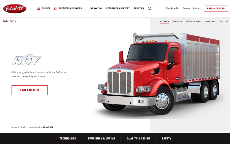
Translate engineering excellence into a digital experience worthy of the brand.
Peterbilt has spent decades building a reputation for durability and craftsmanship: its trucks are recognised across North America as symbols of pride, not simply commercial vehicles.
I redesigned the corporate website from the ground up, creating a modern, responsive experience that balances Peterbilt's industrial heritage with contemporary digital expectations: serving customers, fleet managers, dealers and prospective buyers.
The Challenge
For a company known for precision, the website needed the same attention to detail.
Peterbilt manufactures trucks recognised across North America, yet its digital experience no longer reflected the innovation behind the products. The site had grown organically over years: fragmented navigation, inconsistent hierarchy, and a browsing experience that made it hard to compare models, understand specifications or discover the breadth of the offering.
The redesign focused on communicating the strength of the brand while making complex product information easier to navigate.
Design Approach
A narrative-driven experience: the trucks sell the aspiration, the interface delivers the information.
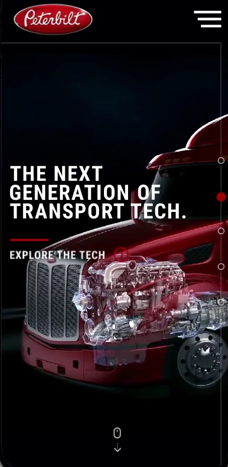
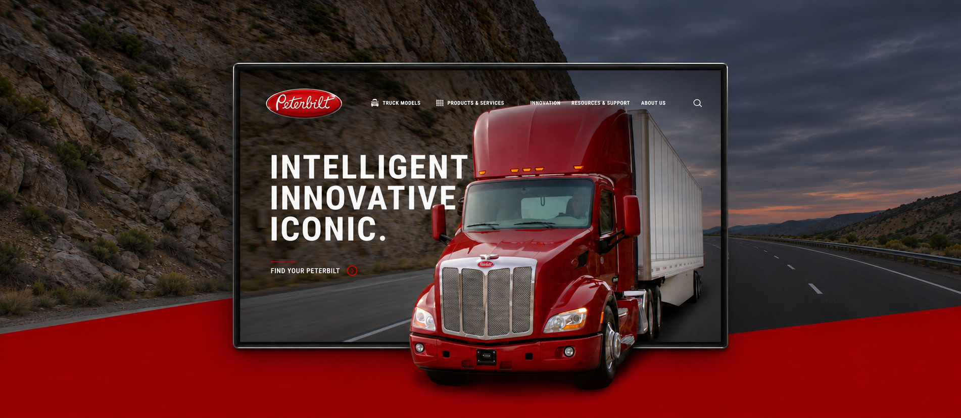
Rather than overwhelming users with specifications from the first interaction, I created an experience that lets visitors progressively explore the product ecosystem. Large photography celebrates the trucks as heroes, while modular content blocks create rhythm through features, technology, performance and customisation.
Generous spacing, bold typography and a simplified hierarchy reduce cognitive load without sacrificing the richness of the technical information.
Visual Language
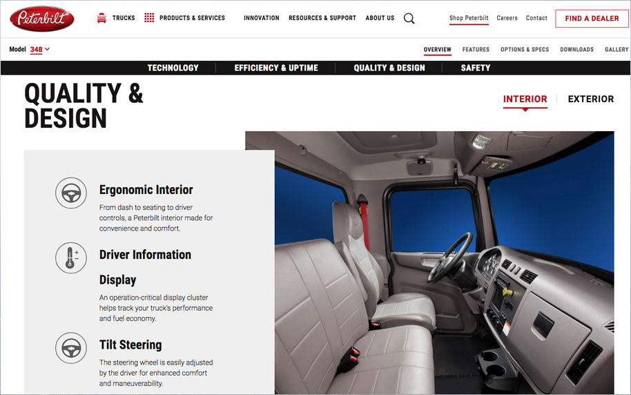
A premium industrial aesthetic drawn from the products themselves.
Strong horizontal compositions, confident typography, restrained colour and high-impact photography create an aesthetic that feels authentic to the brand rather than decorative. The interface intentionally avoids excessive effects, letting product imagery carry the emotional weight while clean layouts keep the experience highly readable.
Every decision reinforces qualities already associated with the Peterbilt name: strength, precision and reliability.

Designing for Multiple Audiences
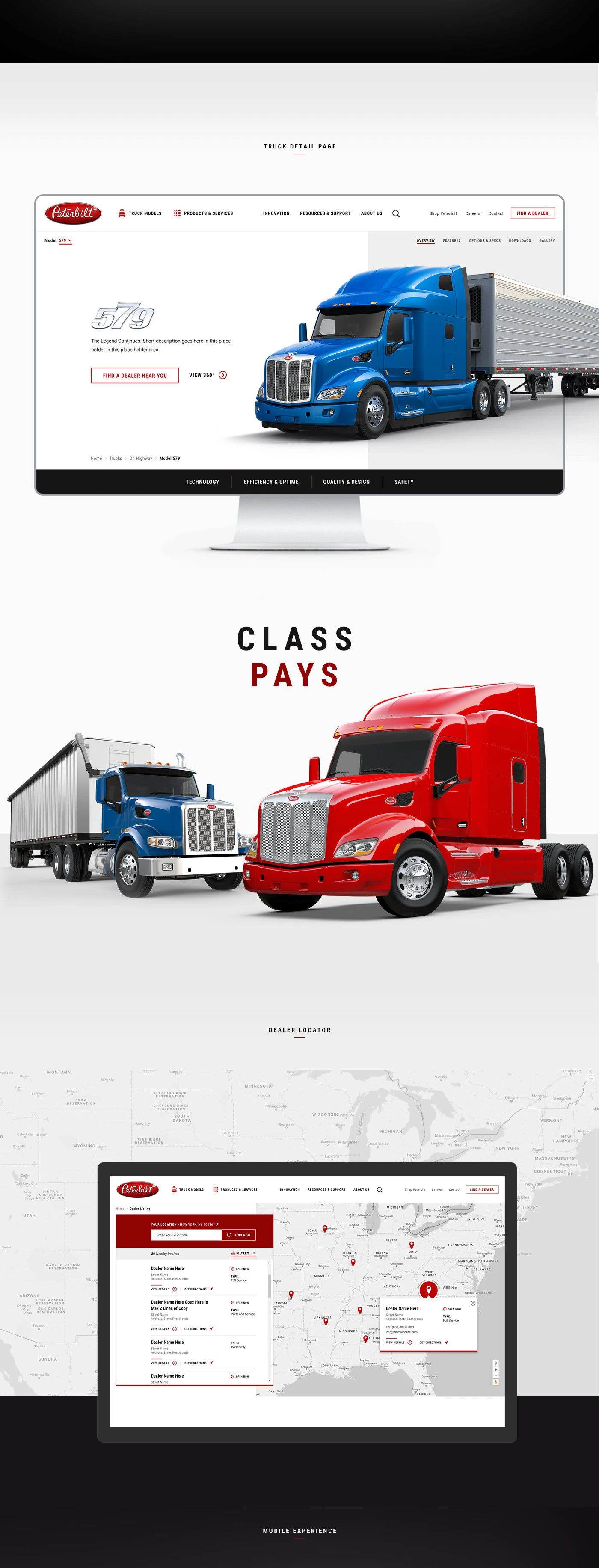
One connected ecosystem, many different journeys.
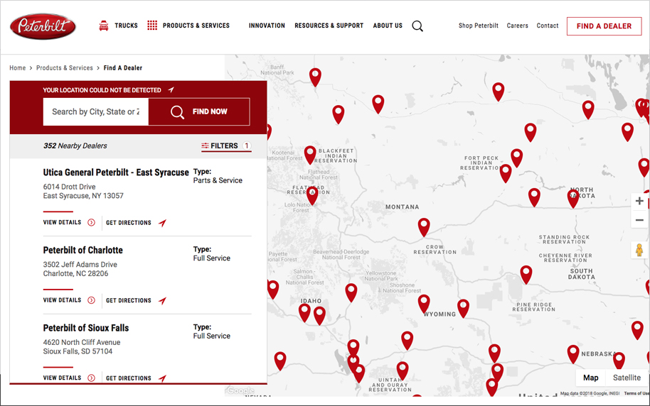
Some visitors arrive knowing exactly which model they want; others are exploring financing, locating dealerships, researching fleet solutions, comparing specifications, or discovering the brand for the first time. The navigation architecture was completely reorganized to support these journeys while reducing unnecessary complexity: letting users move naturally between products, technical information, services and support without losing context.

Watch the original Vimeo films
The outcome
Clearer routes from model research to a dealer.
The responsive redesign brought model information, specifications and dealer search together. A modular Drupal 8 system gave the team a consistent way to publish and update product content.
Have a similar project in mind?
If your website needs to make a complex product range easier to explore, I’d love to hear what you’re working on.
Tell me about your project