Independent UX audit · Websites and products
A practical UX audit your team can act on
I review websites and digital products to identify where structure, interaction, content or responsive behavior creates friction. The outcome is a prioritised set of findings, not a vague list of opinions.
Sample deliverable UX & accessibility
Checkout UX audit
Three illustrative findings from a fictional checkout, with severity ratings, annotated evidence and recommended fixes.
- Scope
- Delivery, order review and plan confirmation
- Method
- Expert review and contrast measurement
- Priorities
- 2 high, 1 medium
Finding 01 Accessibility
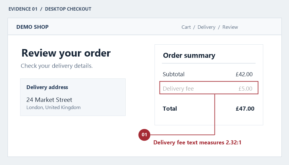
High priorityDelivery fees are hard to read
- Observation
- Normal-size delivery fee text uses #AAA on white. The contrast ratio is 2.32:1, below the 4.5:1 minimum.
- User impact
- People with low vision may miss a charge before they confirm the order.
- Recommended fix
- Use a darker text colour. Test the fee label and amount at their actual size and across all checkout states.
Finding 02 Layout
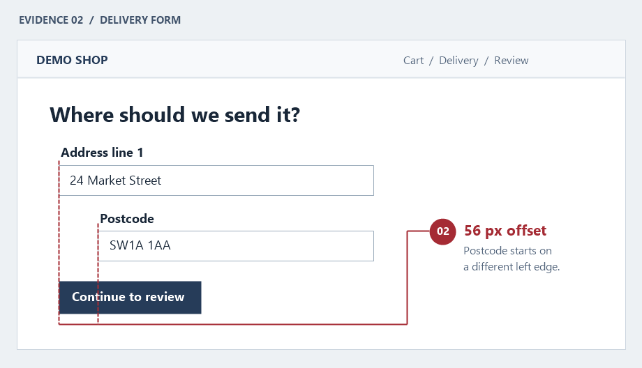
Medium priorityThe delivery form loses its alignment
- Observation
- The postcode label and field shift 56 px to the right of the shared left edge.
- User impact
- The offset makes a related field look nested or optional and interrupts scanning.
- Recommended fix
- Use the same form column for labels, fields, and the primary action. Check the grid at narrow viewport widths.
Finding 03 Content
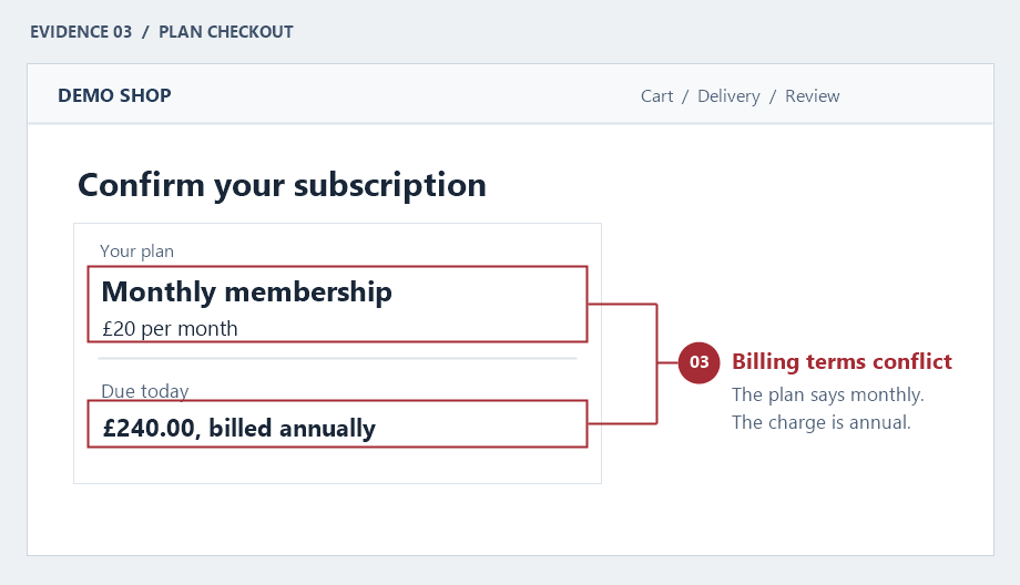
High priorityMonthly and annual billing contradict each other
- Observation
- The plan is labelled monthly, but the checkout shows an annual charge of £240 due today.
- User impact
- People can commit to a different payment schedule than the one they expected.
- Recommended fix
- Name the actual billing period, show the amount due today beside the plan price, and repeat the same terms at confirmation.
Who it is for
- Teams preparing a redesign but unsure where to begin
- Products with usability complaints or weak engagement
- Marketing sites with unclear journeys
What I deliver
- Heuristic UX and interface review
- Navigation and architecture assessment
- Responsive and accessibility observations
- Content hierarchy and conversion review
- Annotated evidence and severity ratings
- Prioritised roadmap
How I work
I first establish the audience, product goals and critical tasks, then follow real journeys across representative devices.
Findings distinguish high-impact blockers from refinements so teams know what to fix now, test next or redesign later.
Common questions
Do you need analytics access?
Analytics, research and support data help when available, but I can also conduct a useful expert review without them.
Can you redesign the issues?
Yes. The audit can stand alone or become the foundation for a focused redesign.